HOW TO CREATE A VISUALLY IMPACTFUL PRESENTATION WITHOUT THE HEADACHE
Do you want to improve your presentation design skills? Try these top tips for starters and if you still need advice then get in touch…I’d be happy to help.
www.mariacasale.co.uk/get-in-touch
ONE
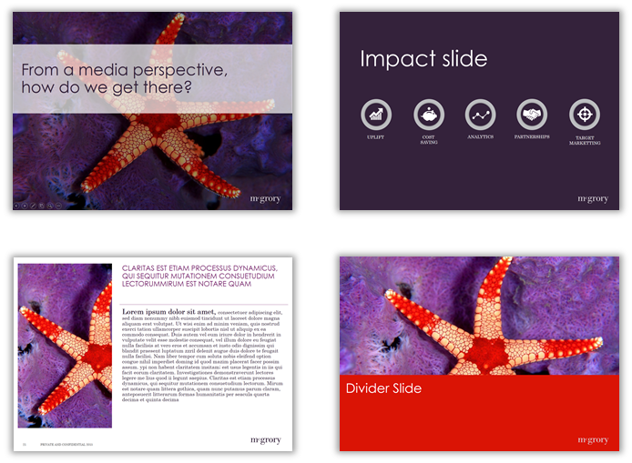
Always start in the slide master. This is where you create the overall layout and look & feel for the ppt. By setting up in the slide master it will keep the ppt looking consistent throughout. Look for inspiration before you start. Block colour and bold text can be very effective, for example. Try www.canva.com for layout tutorials, advice and inspiration.
TWO
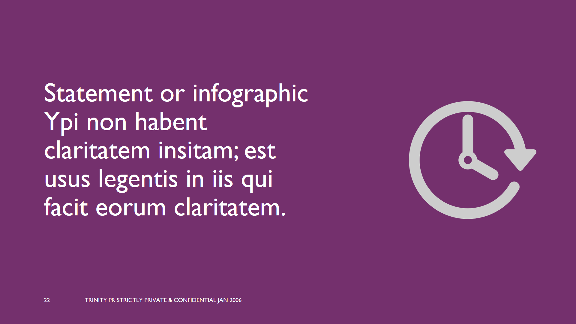
In the slide master, set the colours and fonts. Keep them neutral and clear to read. Don’t make the fonts too big in the slide heading and body copy. Save big, bold copy for statement slides, and divider slides. Use colours that compliment each other, like warm blues and dark greys. Or if you have a company logo, select one of the colours from the logo and incorporate this colour, maybe for the bullet points or slide heading.
THREE
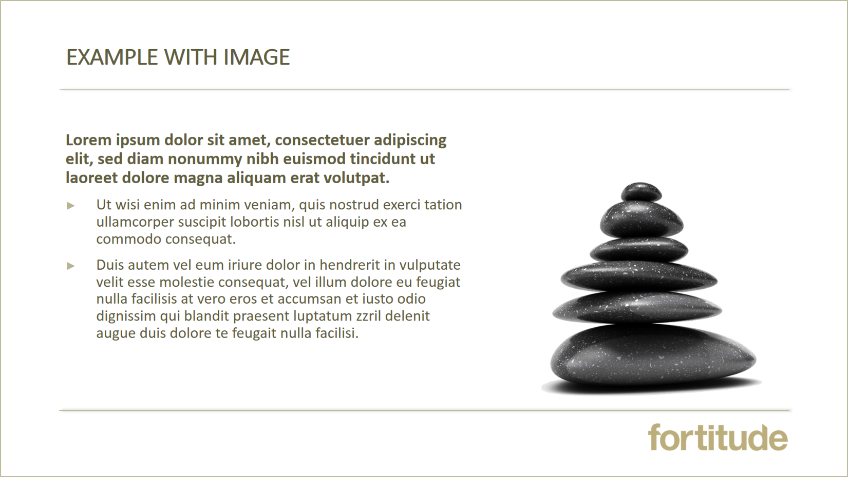
LESS IS MORE: Try to keep the main slides consistent and without too much detail on each page. This will keep your ppt clean and easier to insert images, diagrams and charts. Adjust the text box so it is appears left to middle of the page. This will leave the right-hand side free for images.
FOUR
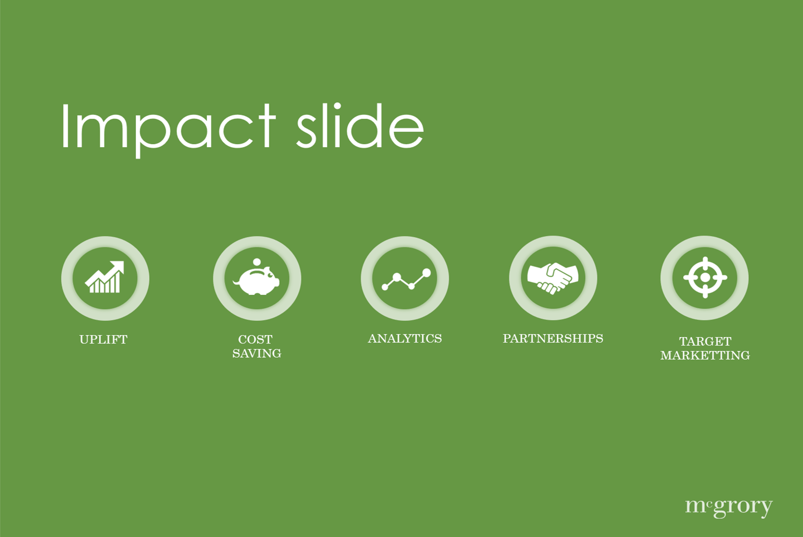
Don’t use lots of complex charts and diagrams to highlight a point. Think of creative ways to do this. Take the key information from the chart and bullet point it, then use an impactful image or info-graphic to emphasise. e.g. a bar chart showing 80% growth for 2012 . Use a bullet to state the growth, then use an image of an arrow growing upwards. If you need to create a chart or diagram, use ‘Smart Art’ to help you and think about the colours, keep them consistent with the overall look and theme.

FIVE
When using logo’s, if you don’t already have a good quality image, then search properly in ‘Google Images’. Check the file size as larger the file the better the quality. Save the images properly on your computer then insert into your ppt. If the logo is going to appear throughout the presentation, set it up in the slide master, keeping it in the bottom right or left hand corner.
SIX
If you want to insert an image and you don’t have image rights, search in ‘Google Images’ for non-watermark pictures. Again, look for high res images and save properly before inserting into the ppt. Stay away from images with coloured backgrounds or boarders. This will help keep the ppt looking clean and professional. Check out www.splitshire.com

SEVEN
Use a transition fade, this will give a smooth transition between slides and a more professional look. You can set this up in the slide master or in the slide sorter. Ctrl A to select all your slides, then go to ‘transitions’, and select ‘fade’.
EIGHT
Don’t use builds unless necessary. If you need to use builds keep them simple. I recommend using a ‘fade’ or ‘zoom’. Always make sure the build doesn’t appear too quickly. Change the build setting in the ‘animation pane’ select ‘timing’ and change from very fast to fast or medium.
NINE
Don’t ever use clip-art if you want a sophisticated presentation. Iconography and info-graphics are a much better way to visually emphasis a point. Try www.flaticon.com
TEN
Keep your content to the point and relevant. Map out the overall objectives of what you want to communicate before you start. If the ppt is quite long, break it down and use divider slides to distinguish the different sections. Always have a final slide to show the end of the presentation, saying ‘thank you’, ‘end’ or ‘any questions’ etc. thin of your presentation as a story with a beginning, middle and end. It’s very important you structure your content and map out your slides. Ensure you don’t over complicate the language. Lastly make sure you rehearse and allow enough time in your preparations.


Recent Comments